Load Board Responsive Redesign
Overview
Ship.Cars is an auto transport logistics company, providing a suite of software solutions to the car hauling industry.
A Load Board is a marketplace where dealers and brokers advertise available vehicles needing shipping to qualified carriers/truck drivers.
As the lead UX designer at Ship.Cars, I worked on the UX and UI for this redesign. Including new navigation, search, and load listings.
The challenge was to take a mobile-first redesign approach without losing any functionality. While still keeping it user-friendly and familiar.
The outcome of the redesign has improved overall satisfaction. It allows users to easily book loads on a mobile device. This has greatly improved the brand’s identity as an industry leader.
The Problem
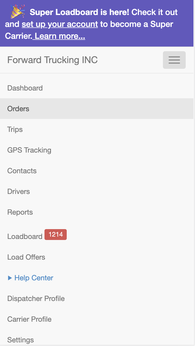
The former Loadboard was not 100% responsive.
Google analytics showed that 30% of our users access our desktop application via a mobile device.
User feedback and Fullstory video recordings indicated that users got frustrated when trying to book a load on a mobile device. The current responsive load board listing obscured the information they needed to see to make a decision. It also was full of visual bugs and was difficult to navigate.
fullstory

Google Analytics
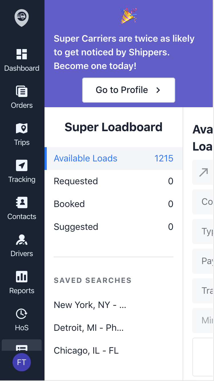
Mobile View: Load Board
Mobile View: Order
Load Board MVP
Research
Who are the users? What do they need? Why?
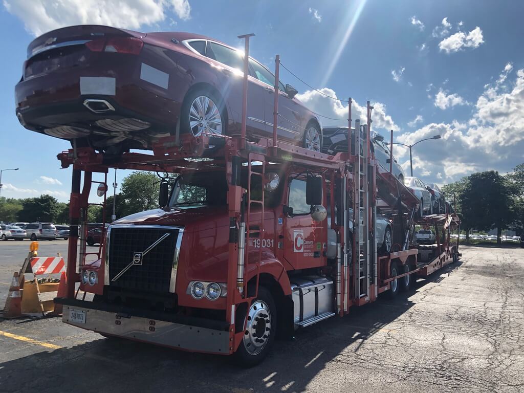
The Ship.Cars load board has two types of users: Dispatchers and Owner-Operators.
Dispatchers are the people behind the scenes who work for car hauling carriers to ensure that truck drivers have vehicles to haul and stick to their appointed arrival times and destinations.
An owner-operator is a small business owner. They drive their own trucks while typically also running the day-to-day operations of the company.
Quantitative Data
To kick things off, We set up an in-app popup survey to learn who accesses our load board via a mobile device. We let the survey run for a couple of weeks.
Here are a few of the questions asked.
- What is your role? (Dispatcher or Owner-Operator)
- Have you ever accessed the load board from a mobile device?
- How often do you access the load board on a mobile device per week?
- Were you able to find loads easily using the load board search?
- Was it easy to book a load?
- Were you able to navigate yourself around the load board easily?
- On a scale of 1 to 5, rate your experience using the load board on a mobile device.
- Can we reach out to you by phone to learn how we can better the load board?
Qualitative Data
To confirm some of the assumptions, we interviewed multiple owner-operators by phone and in-person. This helped us paint a clear picture of who they are and why they are having these problems.
These owner-operators are always looking for loads between pickup and deliveries. They are sitting in their truck or at a coffee shop accessing the load boards via their phone 90% of the time.
We reached out to a few none-Ship.Cars fans. We asked them to pull out their favorite software. It was usually our biggest competitor. These guys tend to be brand loyal. We asked them to show us everything that they loved and hated about it. One driver said he would switch to Ship.Cars if we added a few features; like maps and bookmarking.
User Interview: Owner-Operator Truck Driver
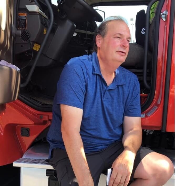
User Interview: Owner-Operators Truck
The results of the survey and interviews told us that our none-responsive load board disproportionately affects owner-operators.
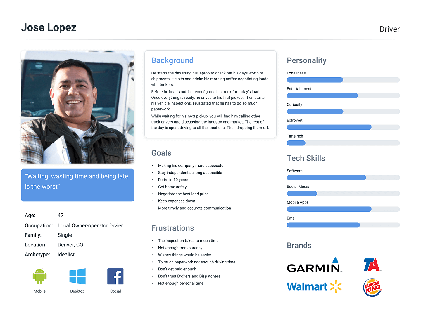
Persona: Jose Lopez, Owner-Operator
What are the competitors doing?
Competitive Analysis is not the solution to all UX needs but will help you understand where your product stands in the market and highlight strengths and weaknesses in your competitors.
We analyzed all of our competitors however; SuperDispatch is one of Ship.Cars major competitors. We knew the owner and the CEO would specifically want to know what they were doing. Turns out they also have a similar responsive problem.
SD Mobile Loadboard
SD Mobile Loadboard
SD Mobile Navigation
SD Loadboard
SD Order Details
Design
The product owner and UX team agreed that we need to take a mobile-first design approach to make the application 100% responsive.
What is Responsive Design?
Responsive web design is a web design method that enables web to fit the screens of different devices automatically, displaying the content in a way that people feel comfortable.
This greatly reduces users’ operations like panning, zooming and scrolling when browsing the web.
When you start with the desktop platform, you tend to want to take advantage of everything that the platform has to offer. You build an amazing product that leverages lots of great technology, only to realize that none of it scales well down to mobile.
Progressive Enhancement
Here we’re starting with a project that is both super lean and quite impressive. You’ve taken all of that starting energy and put it into creating a product that looks and functions well despite the many restraints that you faced.
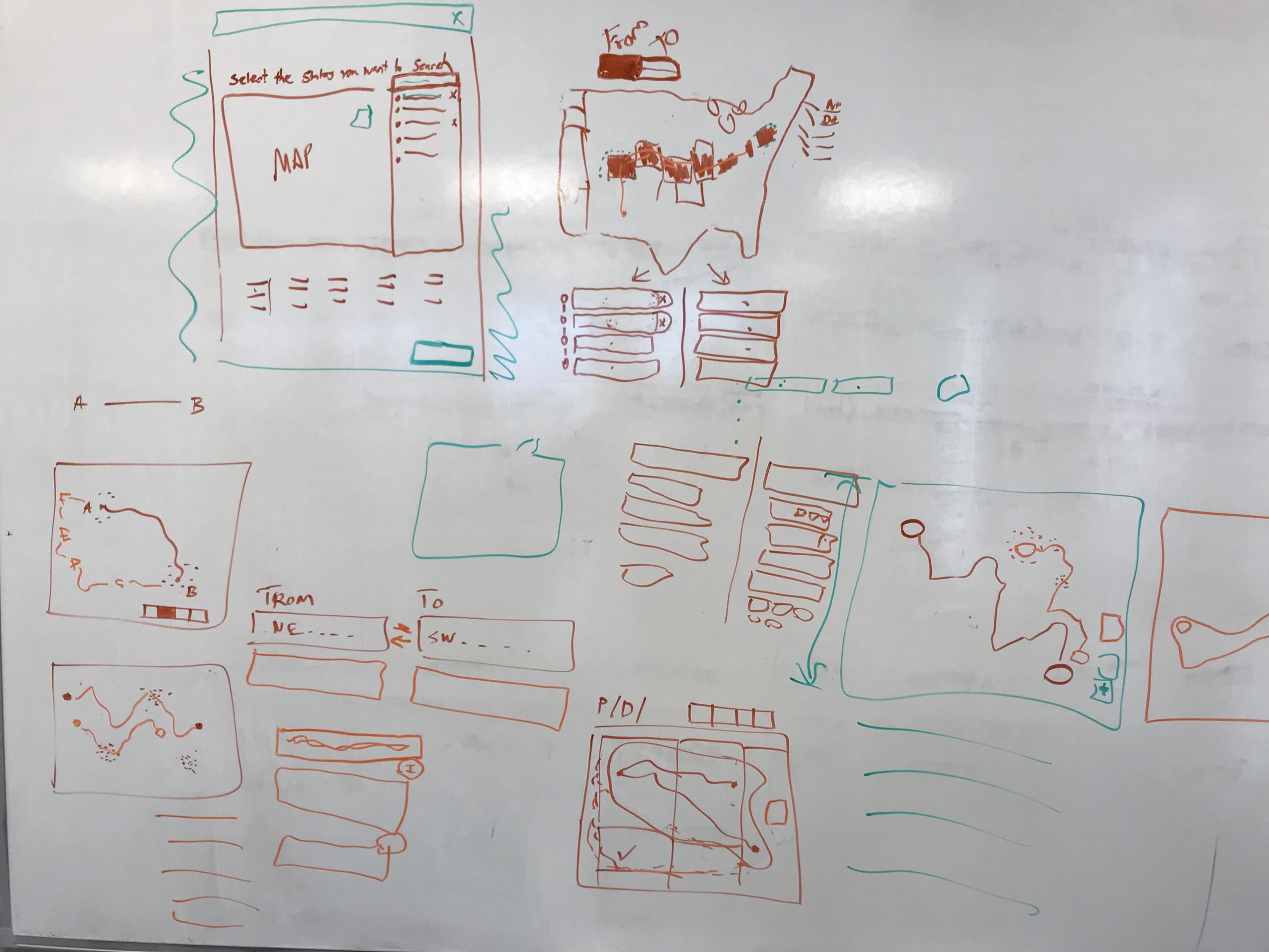
Low Fidelity
Wire-framing Navigation
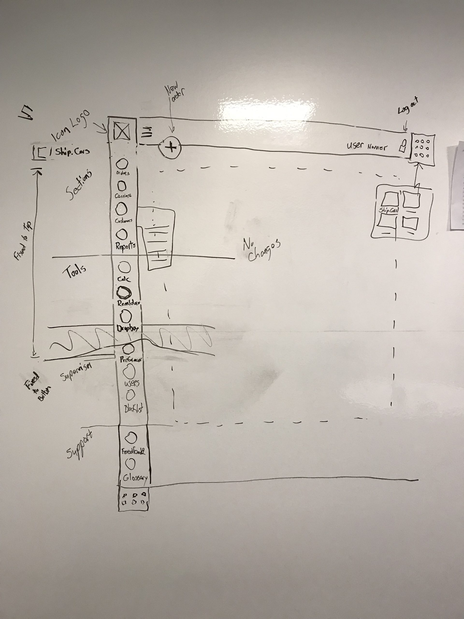
Wire-framing Responsive
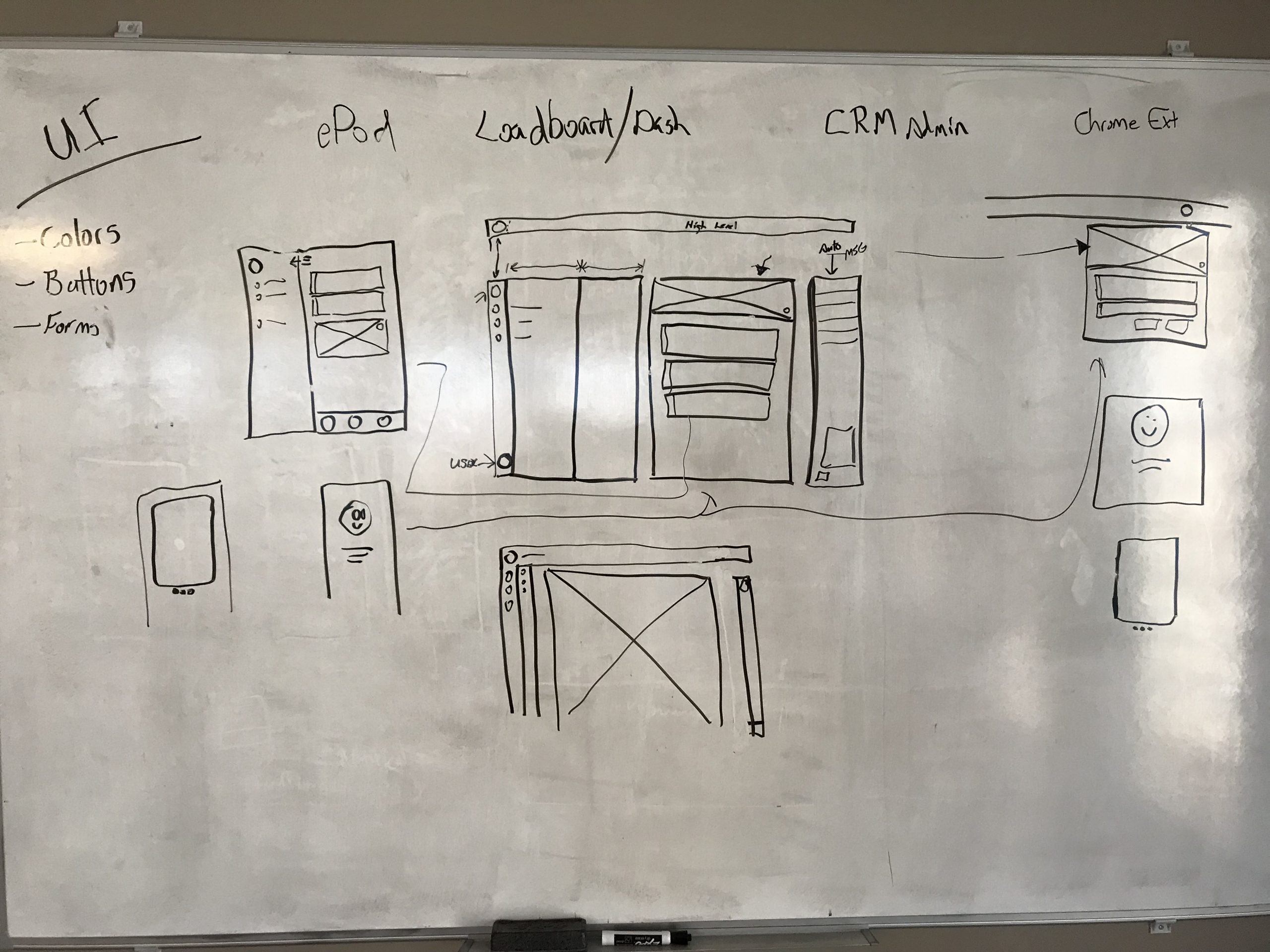
Brainstorming New Functionality
Initial Design
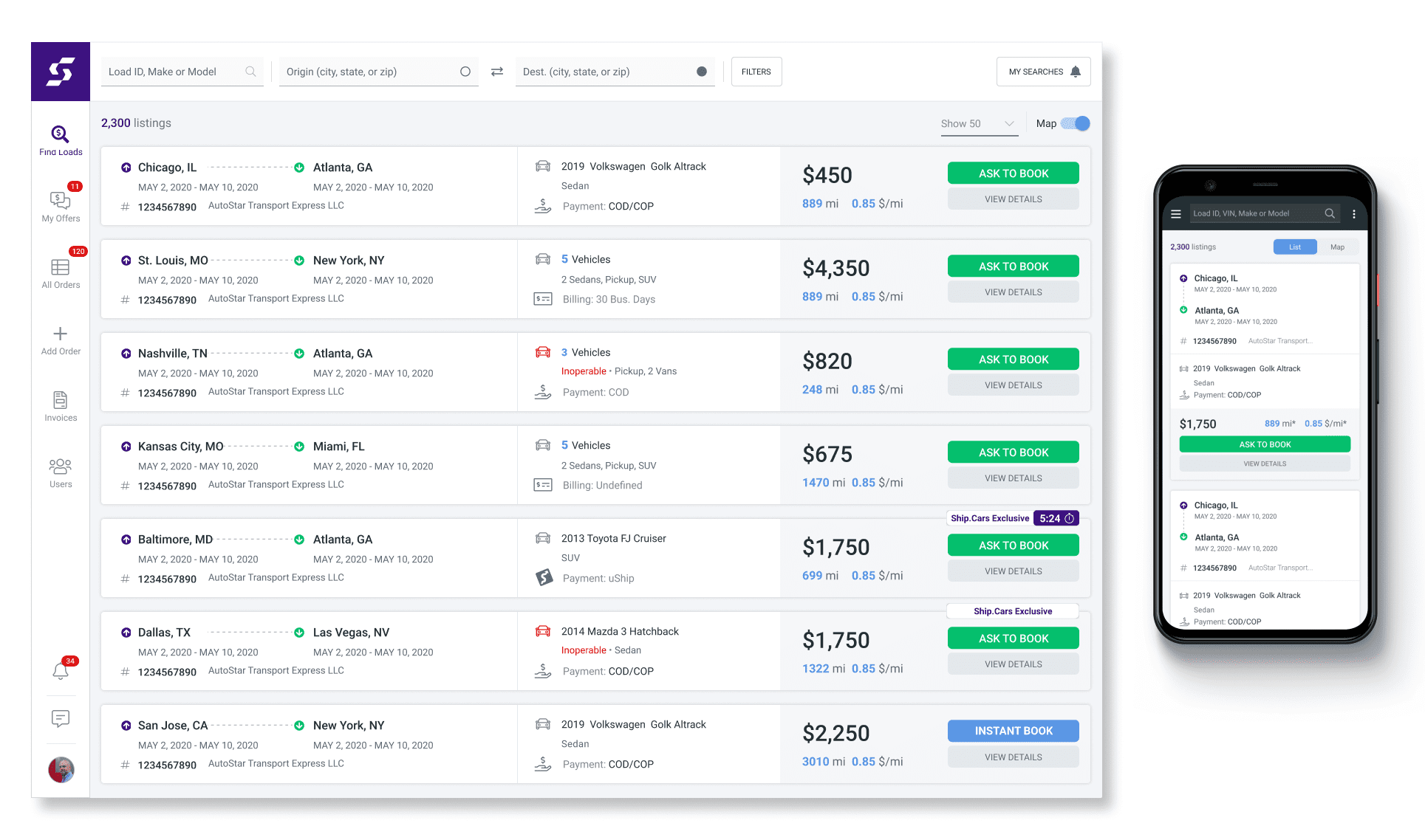
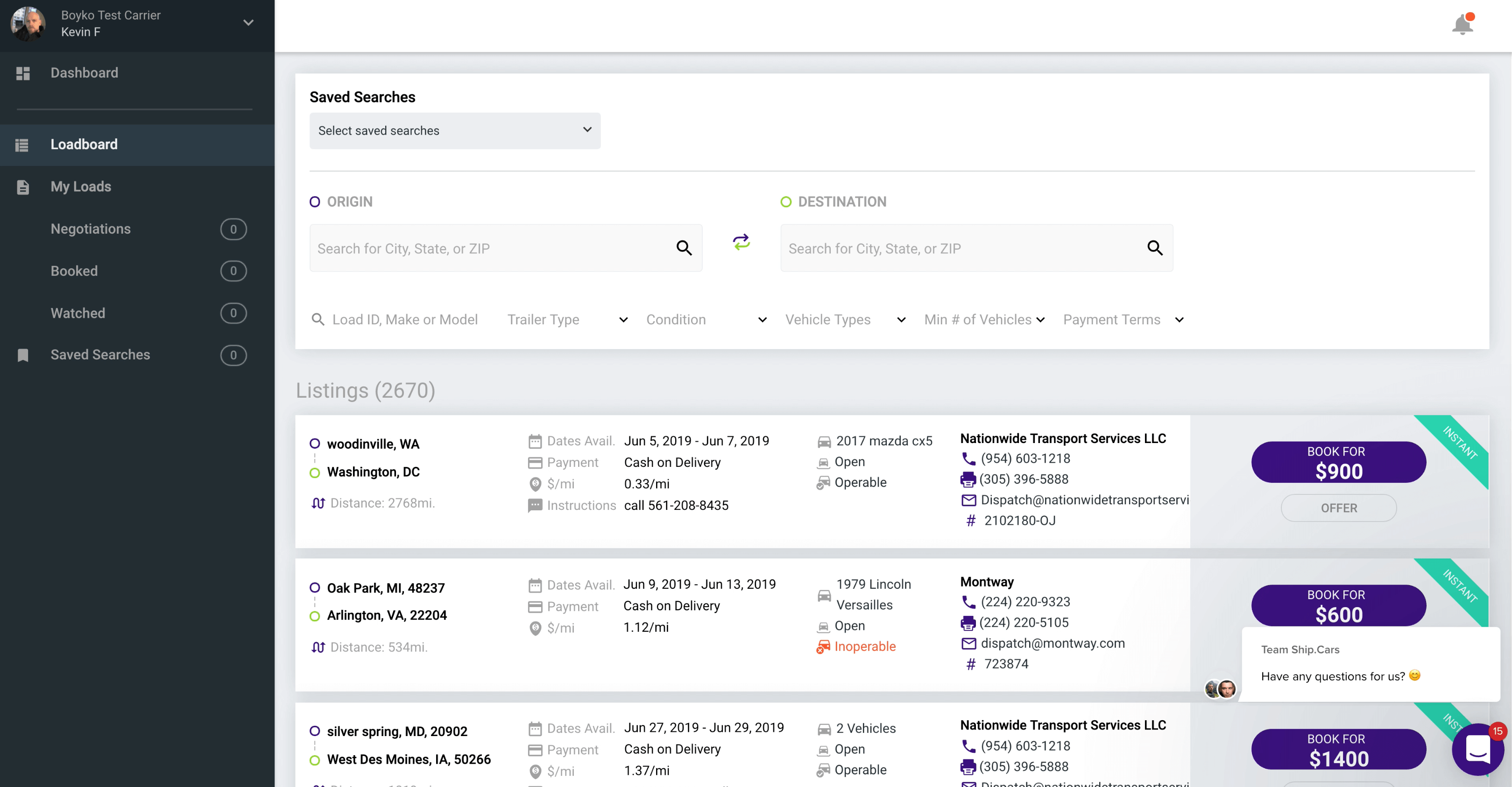
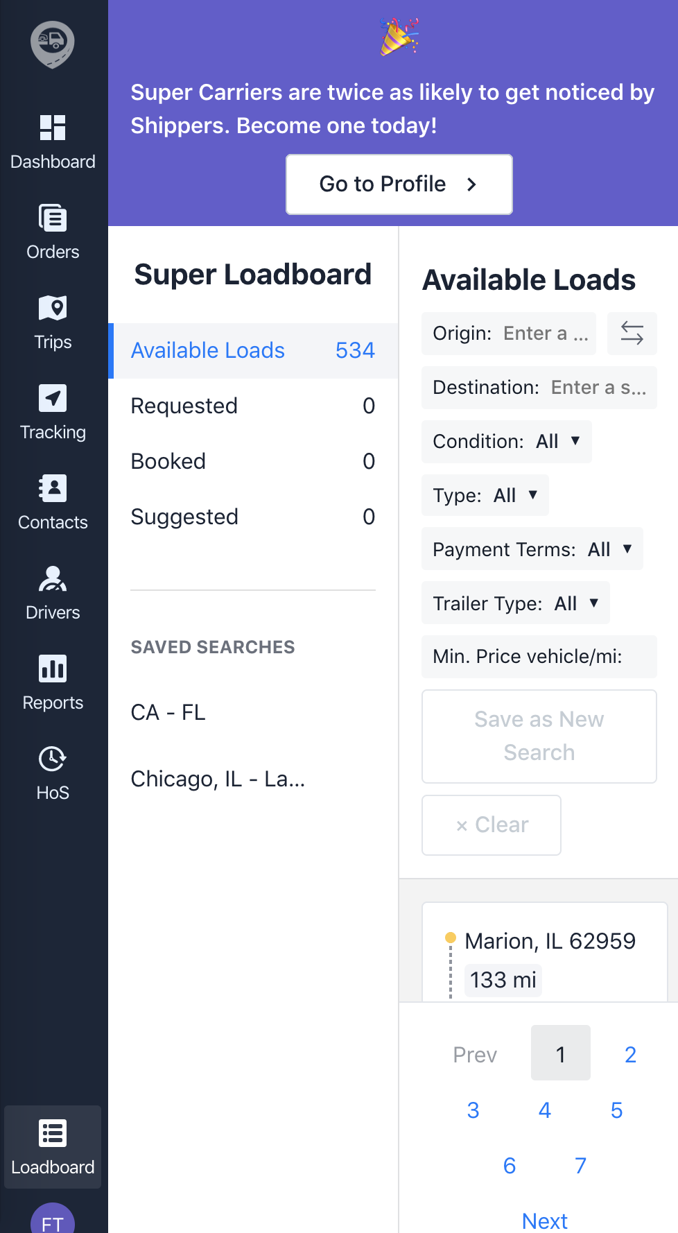
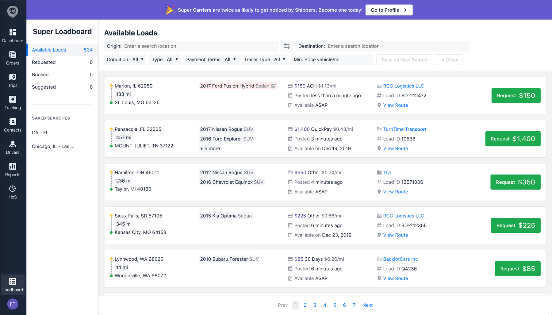
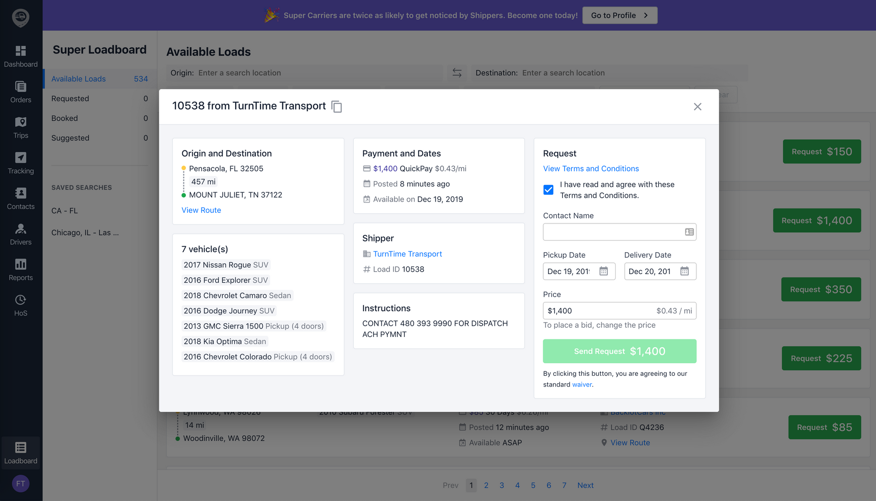
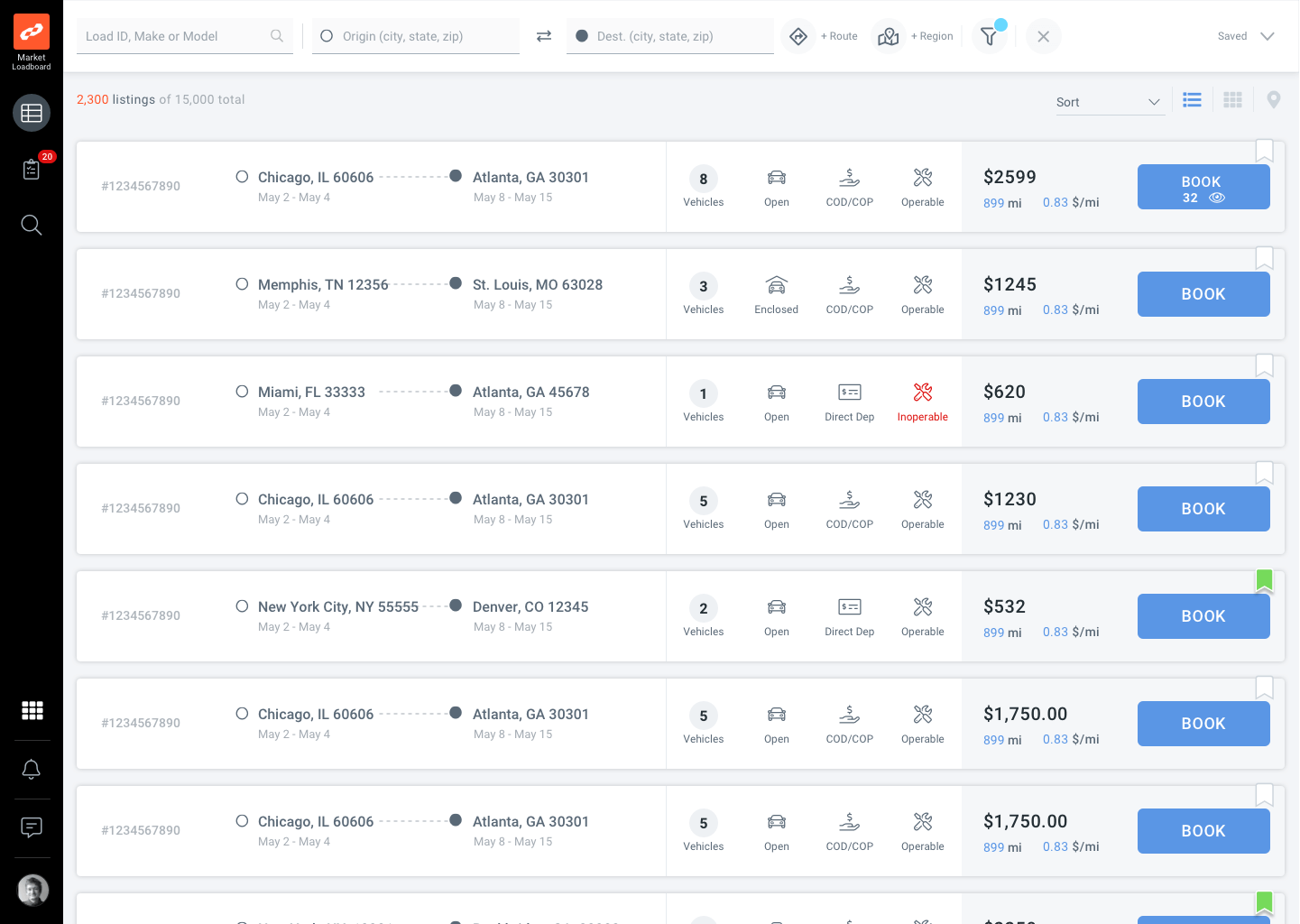
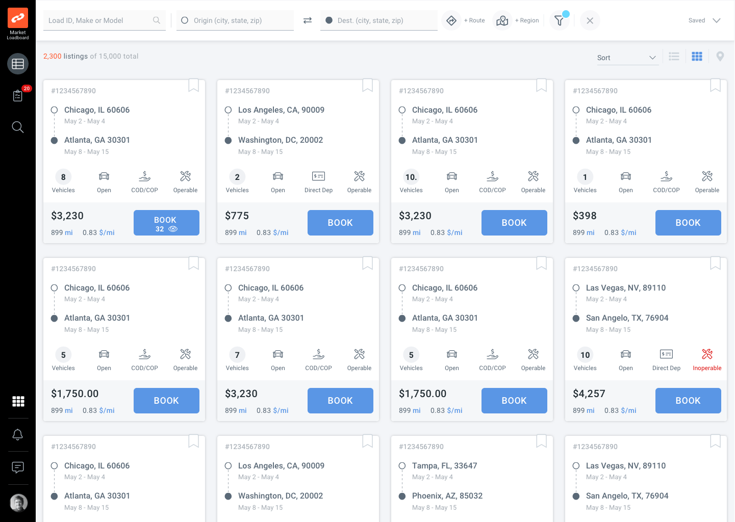
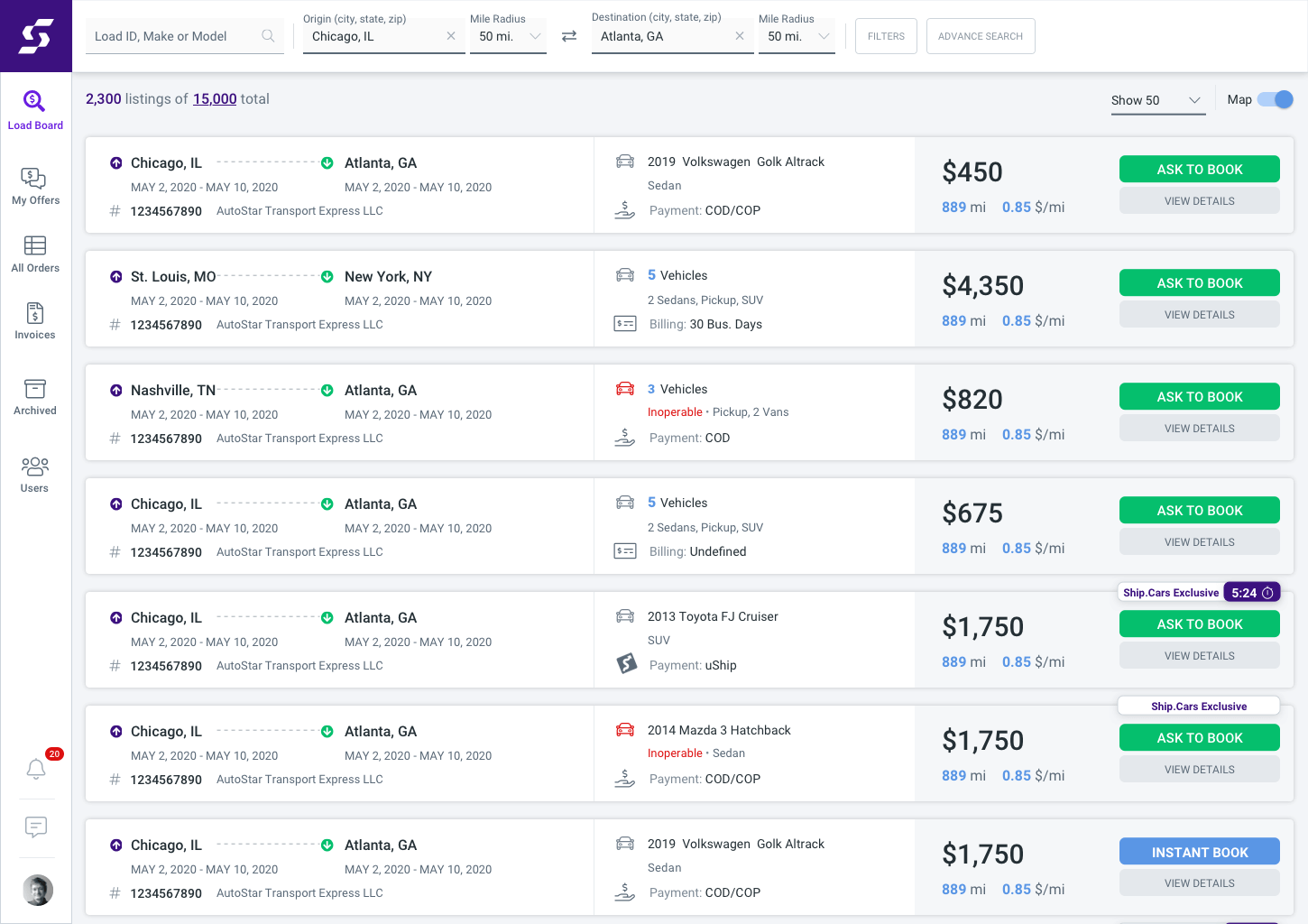
Load Board 2.0: List View
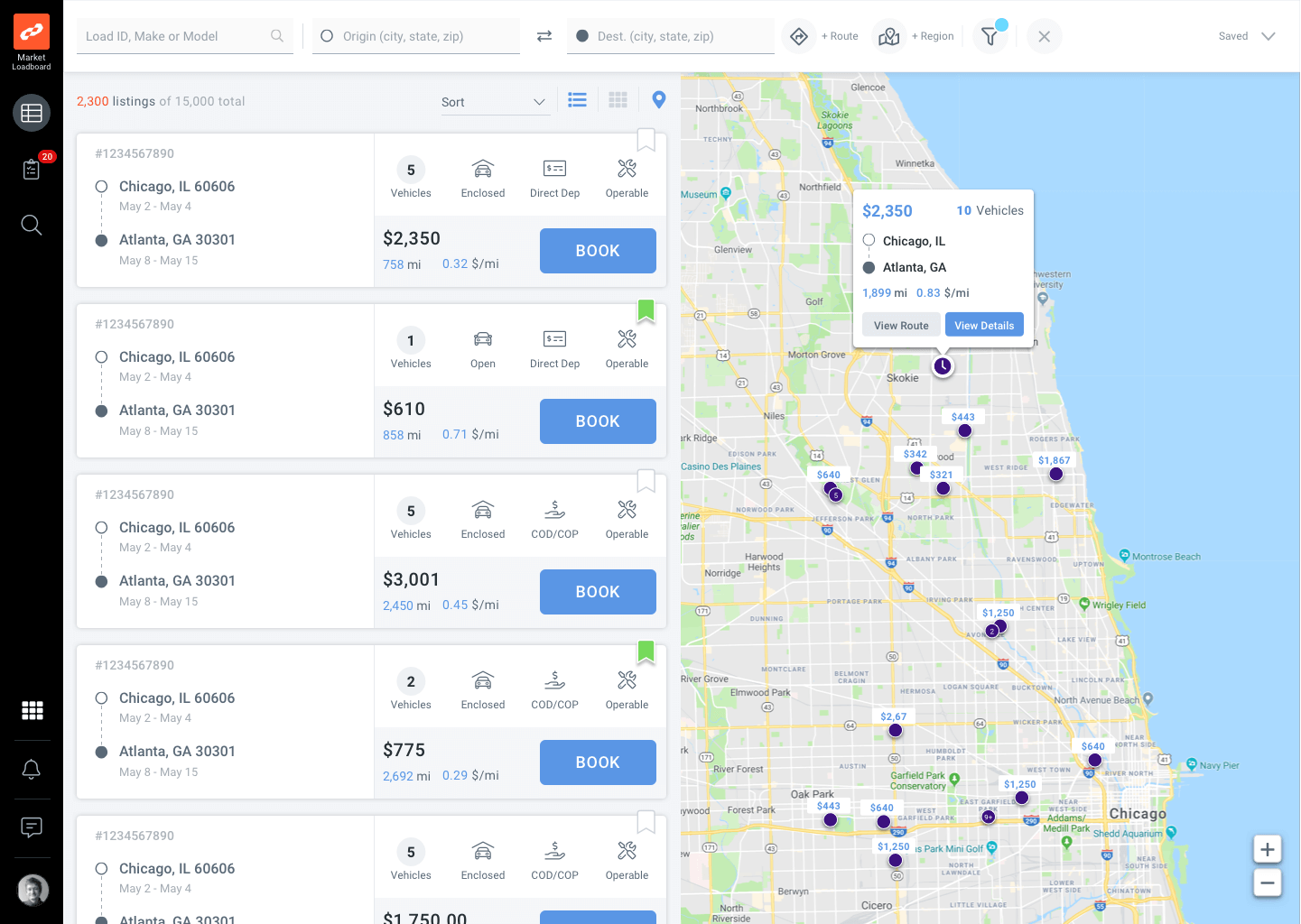
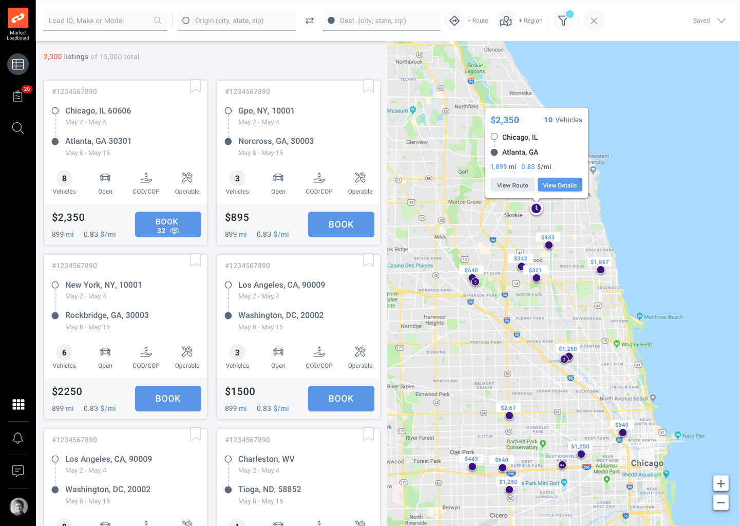
Load Board 2.0: List View with Map
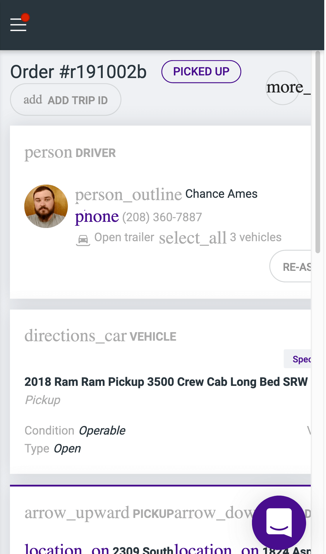
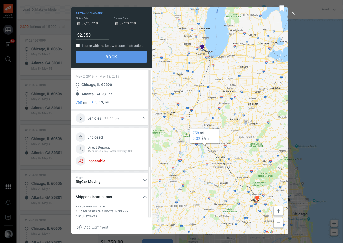
Load Board 2.0: Order Details
Load Board 2.0: Grid View with Map
Load Board 2.0: Grid View
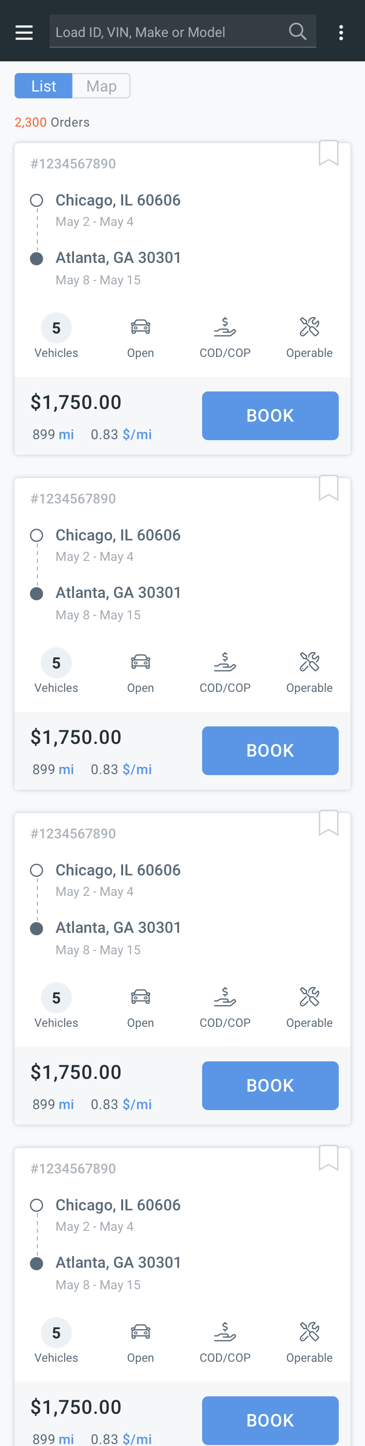
LB 2.0 Mobile List View
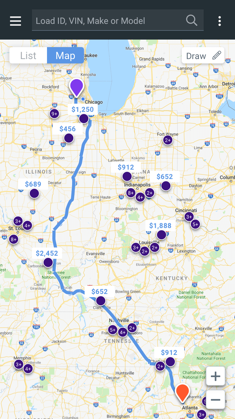
LB2.0-mobile-MapView
Design Revision
LB2.3-w Map

Testing the new designs using InVision prototypes
We test our prototypes internally with other employees first. This way we can find any obvious problems that need to be fixed. Once all their employee feedback is collected we move onto user feedback. We ask them a series of tasks to see how easily they accomplish them.
Final Design: Desktop
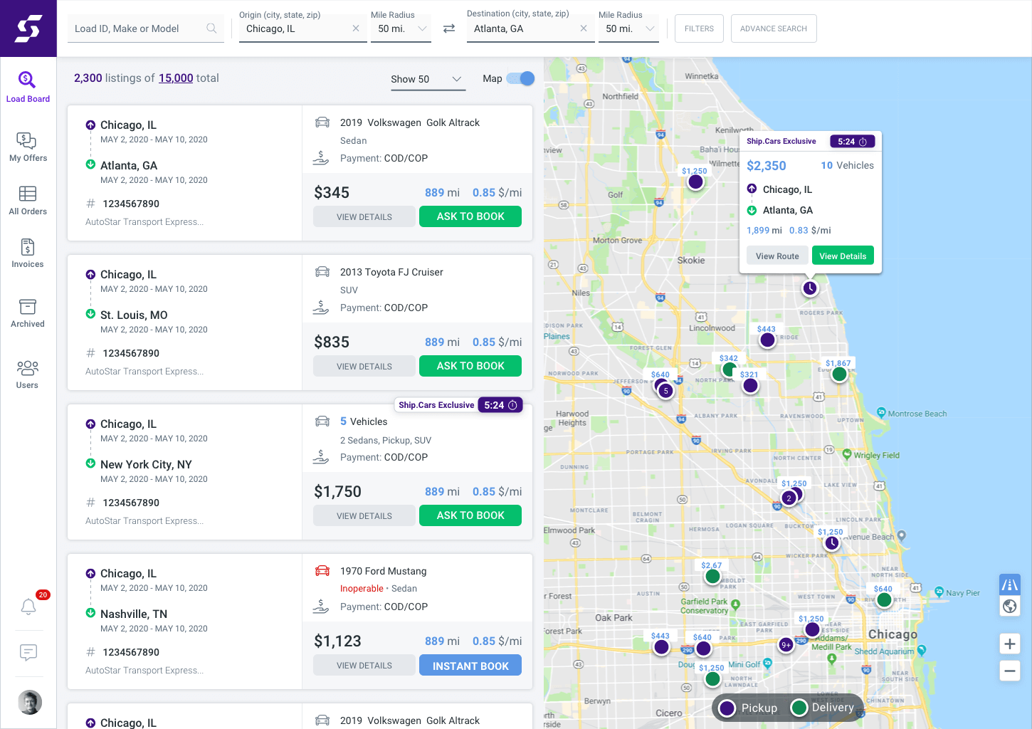
Load Board 2.5: List View with Map
Load Board 2.5: List View
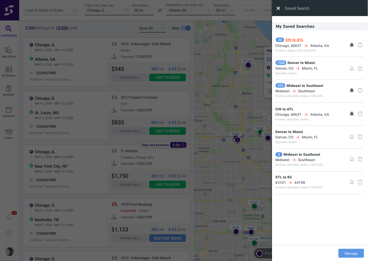
LB 2.5_Save Search Drawer
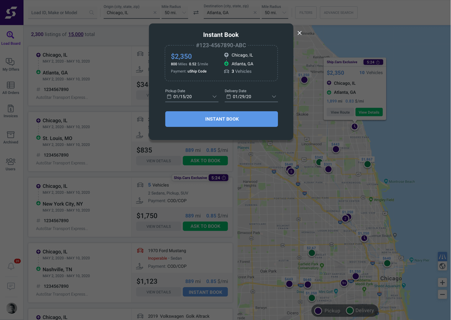
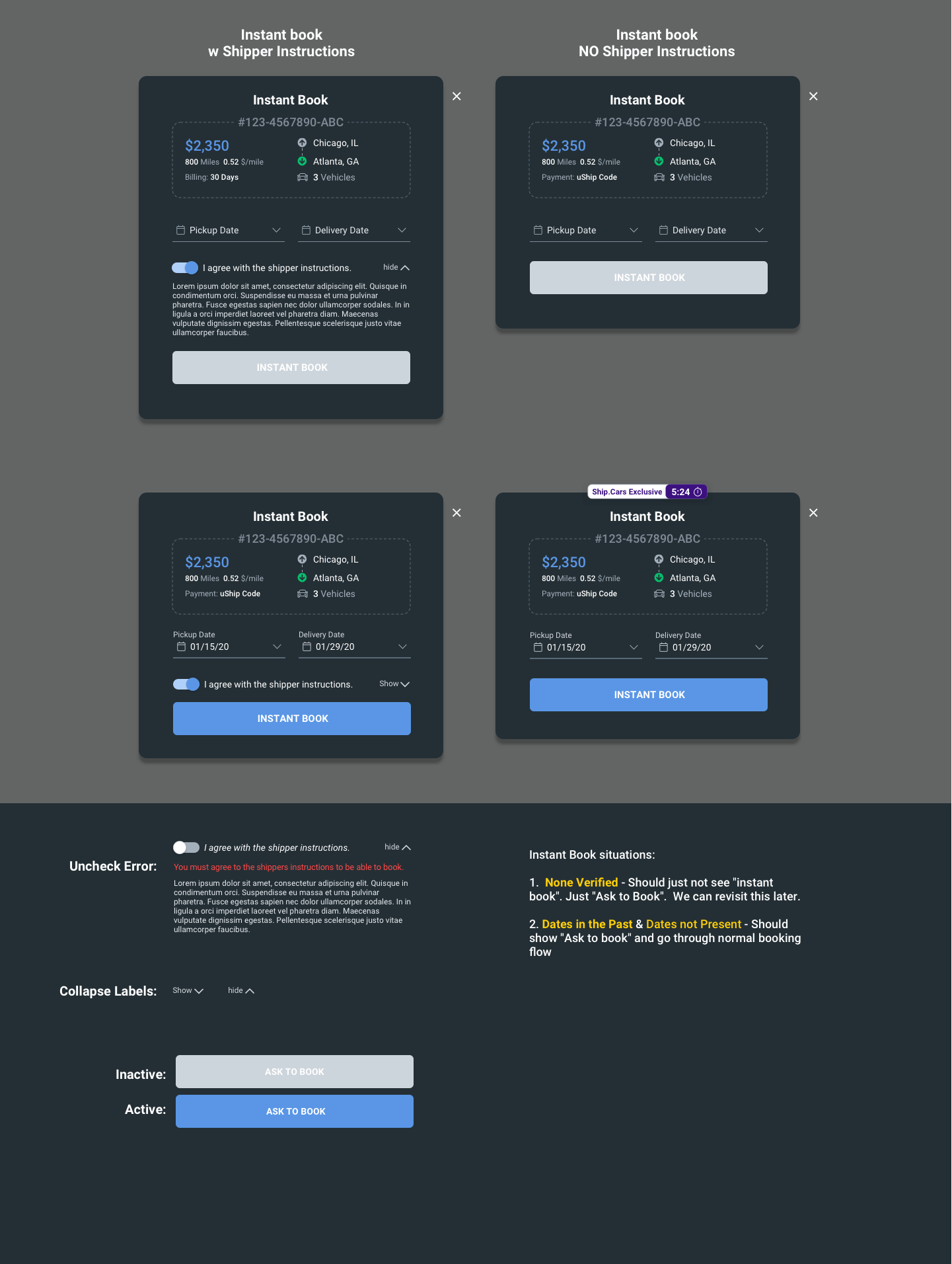
LB 2.5 Instant Book
Tablet
LB 2.5_Tablet_All Loads-Listings
LB 2.5_Tablet_All Loads-Map

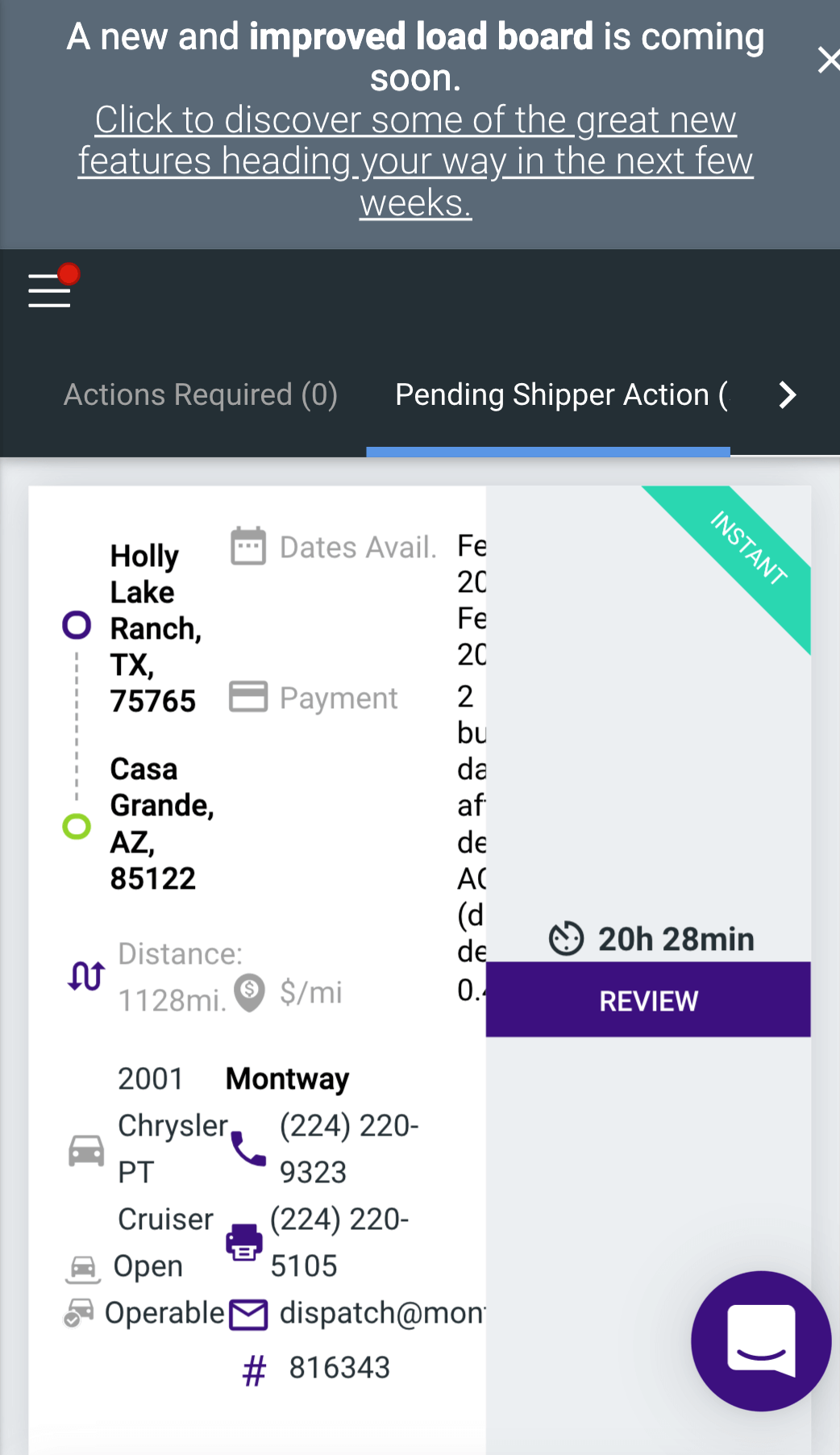
Mobile
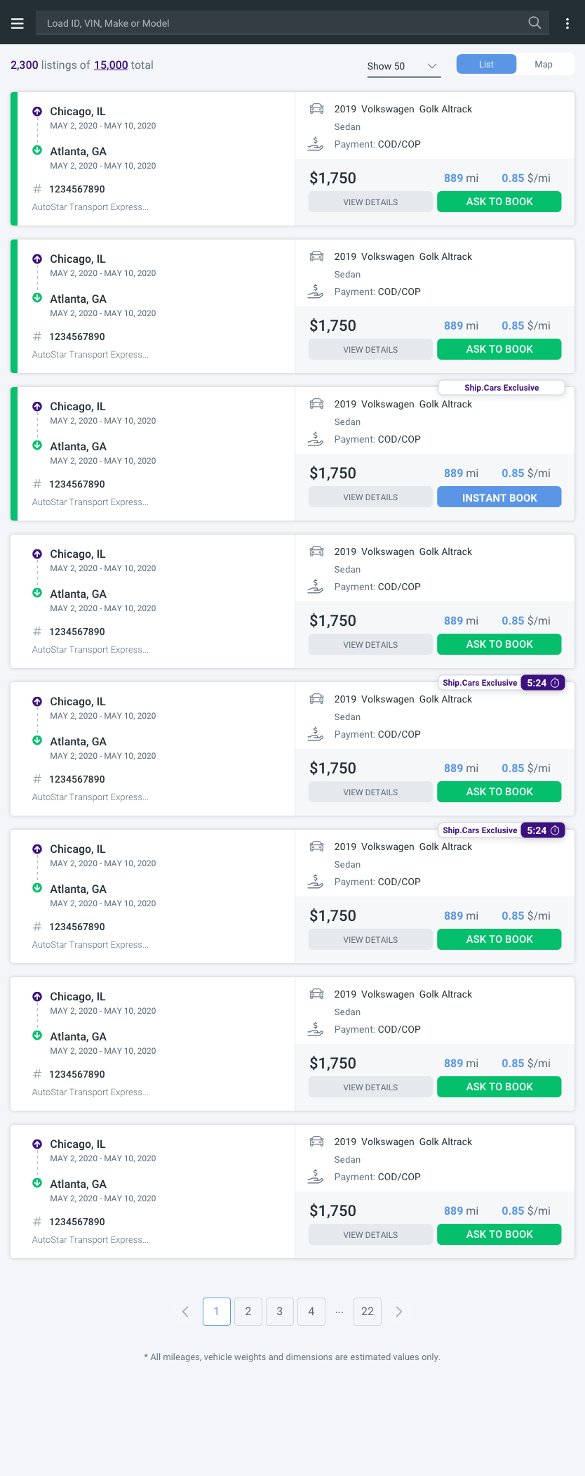
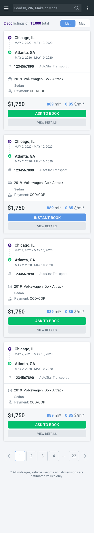
Load Board 2.5: Mobile List View
LB2.0-mobile-MapView
Component Screens
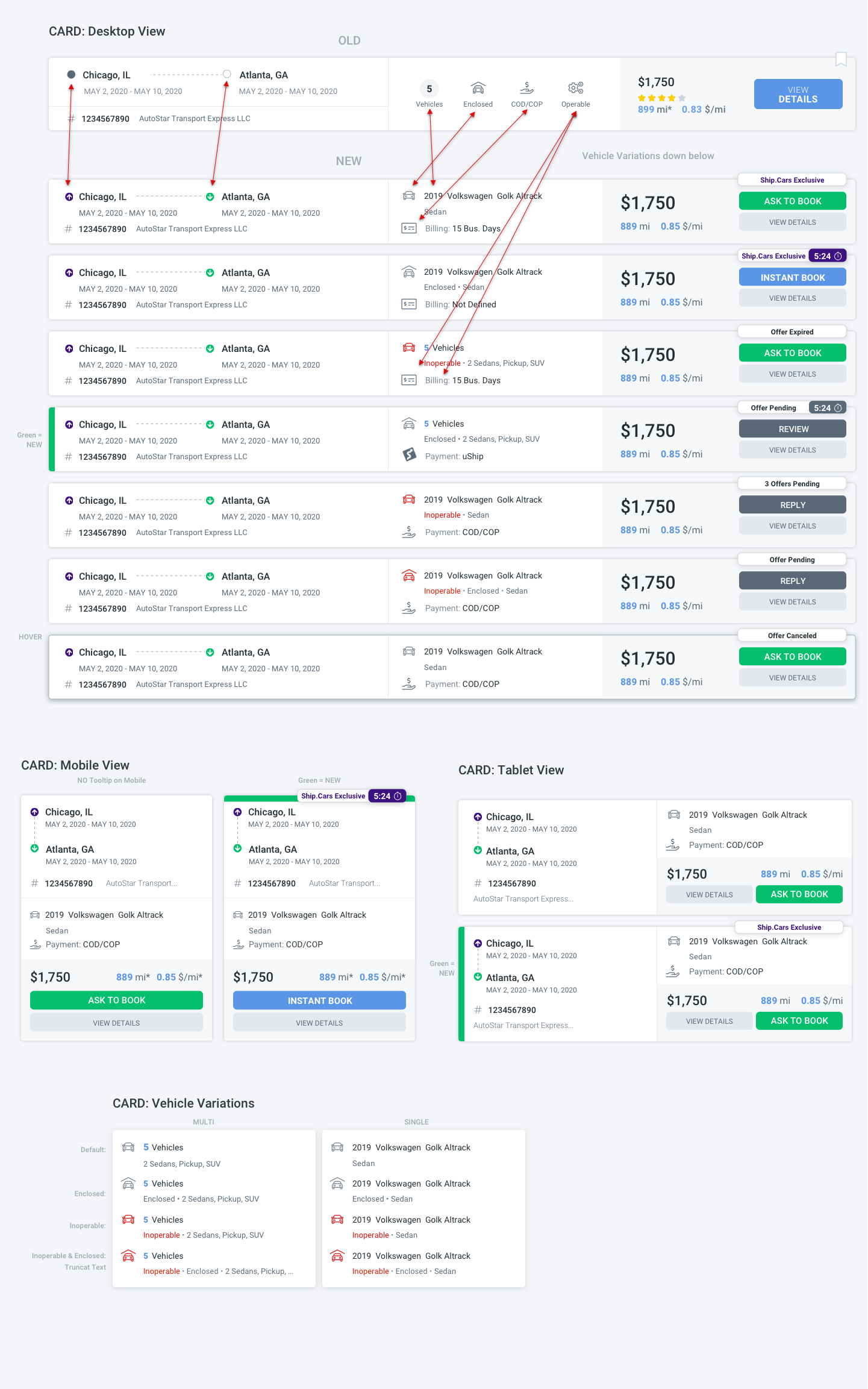
Componants: Cards
Componants: Instant Book
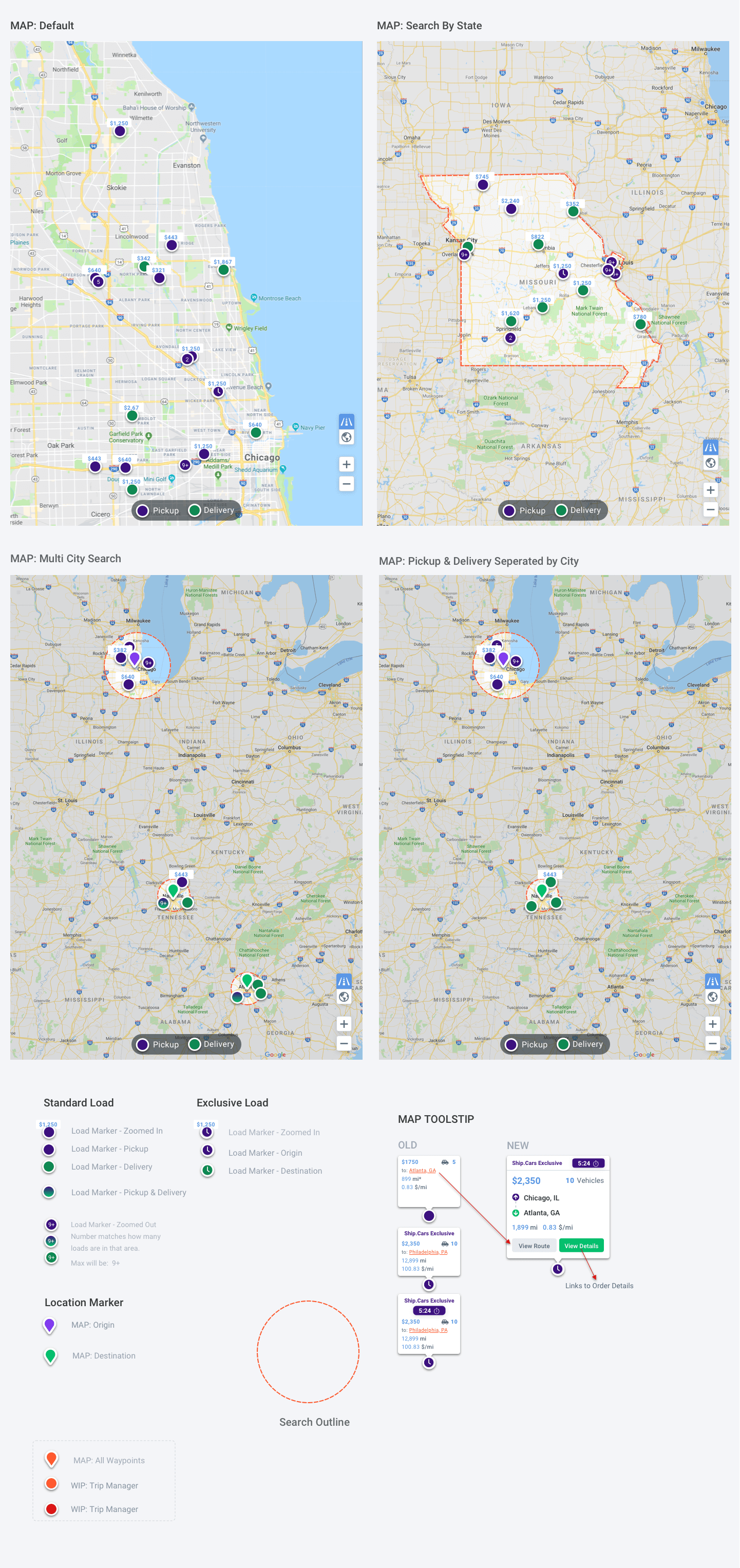
Componants: Maps
The Outcome
The outcome of the redesign has improved overall satisfaction. It allows users to easily book loads on a mobile device. This has greatly improved the brand’s identity as an industry leader.
A few weeks after the redesign launch we sent out a follow-up survey. The results were amazing. Of course, there were a few areas we needed to address. But overall the users love what we did.
Customer satisfaction improved from 20% to 65%.
All the new feedback is being taken into consideration for the next update.
You might also like

Sports Nutrition
‘Sports Nutrition’ was designed with Bootstrap or Foundation frameworks in mind. Designed for WordPress with WooCommerce or Magento 2, but can be adapted to fit most content management systems (CMS).
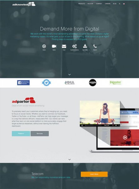
Adknowledge
The Adknowledge marketing team has relaunched a revised, fully responsive version of the corporate website.
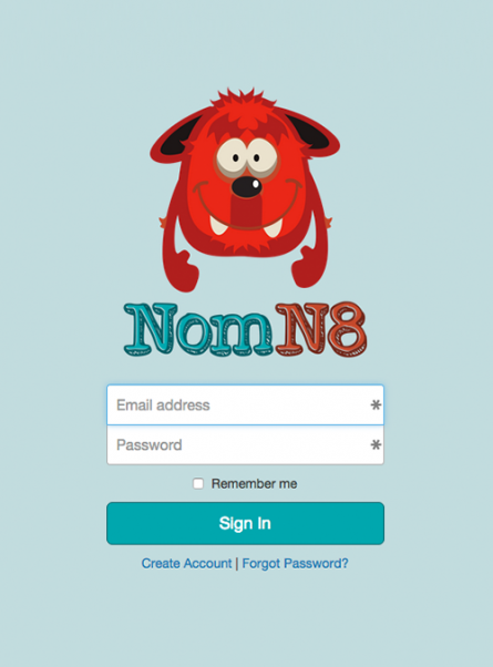
NomN8
The team which stayed awake hacking from 7/18 @ 10am to 7/19 @ 12pm (and hours before and after) walked away from Hack Midwest with the top prize of “Best in Show”. There were approximately 90 developers – 18-20 teams. Our team built from scratch a site allowing people to create a new event, which […]

SoBEERiety
A Beer Tracking, Achievement Giving, & Self-Preservation App. We know you like beer. Our app allows you to easily track the beers you have tried, and quickly rate them. We will track the beers you like, and suggest highly rated choices from other members based on your preferences. Each beer you drink brings you closer […]
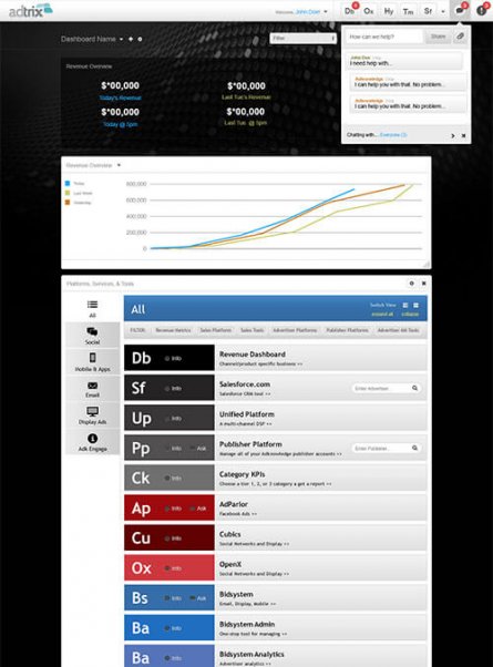
adtrix
Adtrix is a Cross-department application that pulls data from various sources to display on customizable dashboards.